
Color scheme can have a huge impact on your website. In fact, 93 percent of consumers place color and appearance above all other factors when making a buying decision. Your website’s color scheme also bolsters brand recognition and is directly linked to consumer confidence.
Here are three effective tips for choosing the right color scheme for your website.
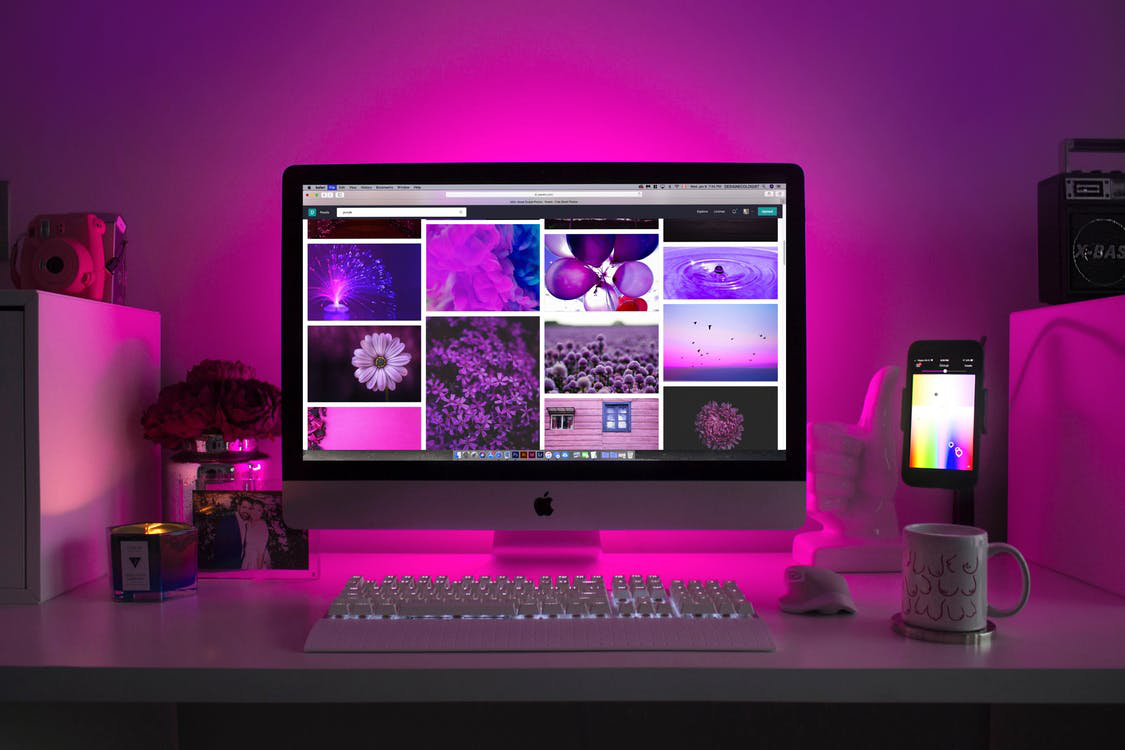
Learn how colors affect emotions!
It’s critical that you understand how colors impact humans to ensure you choose a color scheme that appeals to your audience and complements your brand. For example, red represents excitement, boldness, and youthfulness. This color is used by Coca Cola, Nintendo, and YouTube, among many other popular brands.
Similarly, yellow signifies cheerfulness and creativity. This color is used by Nikon, Nat Geo, McDonald’s, IMDb, and several brands who want to grab the attention of their audience. You get the gist.
Having said that, it’s also important to consider gender when making color decisions, as men and women have different color preferences.
For example, women prefer bright websites, unlike men, who tend to appreciate dark websites.

Keep the target audience in mind!
Many new businesses—especially those run by young entrepreneurs—choose a color scheme based on individual preferences. But it’s important to understand that every decision needs to be based on the psychology of the target audience, instead of a personal choice.
For instance, if your favorite color is pink, it might be tempting to use it on your website. But, if your company sell shirts for men, this will not resonate with the target audience, as it’s the least favorite color among men. As a result, you’d lose sales and have trouble establishing a strong brand identity.
60-30-10 Formula!
You need to decide how many colors you want to use on your website. Getting this number right will help you to create an attractive website. Ideally, you should pick a dominant color, a secondary color, and an accent color.
Moreover, it’s also important to use these colors in the right proportions to create perfect harmony. There’s a formula that goes by the name of the 60-30-10 formula that can help you to decide on the perfect mix.
As per the formula, you should use:
- 60 percent of the dominant color
- 30 percent of the secondary color
- 10 percent of the accent color
This formula is primarily used to give balance to colors used in interior design, but it’s equally effective when it comes to web design.

Bonus Tip: Take the color quiz!
If you’re still having a hard time choosing the perfect color scheme for your website and need some help, you can use online tools such as branding color quiz—available on the Grasshopper website. It will ask you a few questions about your customer and offerings and point you in the right direction.
The color scheme for websites plays an important role, so selecting the right color combination to represent your website can be a difficult task. Evna Design is a logo and website design company in Colorado Springs run by Dylan Satterfield. He has a lot of experience in designing websites and creating attractive user interface designs. Contact Dylan Satterfield at Evan Design today to pick the right color scheme for your website.